A U shape kitchen layout is extra-efficient: using the perimeter of the kitchen to maximise the amount of available floor space while giving you ease of access to everything you need.
It’s a layout that works in kitchens of all sizes (especially compact) – and also looks great in a range of styles: so no matter what your preference, there are plenty of U shape kitchen ideas out there to suit you.
Think Big
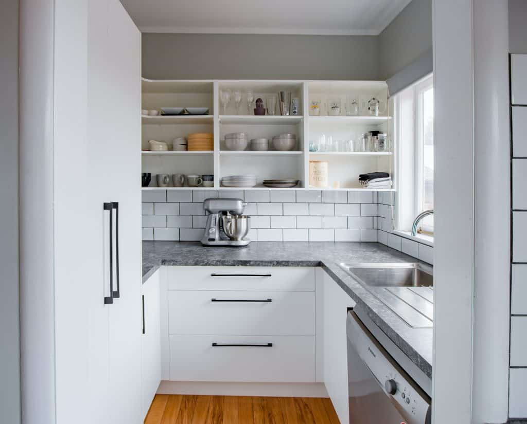
Tiny kitchens require some careful planning to make sure you’re really getting the most out of the space. In many ways, they can be better than larger kitchens (they’re a doddle to clean, for a start!). In this pint-sized example, the size of the room is maximised in three ways: by the U shaped layout of the room, by using open shelving to create vertical storage (remember in small kitchens, the only way is up) – and by creating a sense of space and light through the white cabinetry and tiling, offset by a soft grey shade on the walls.
(Don’t) Get A Handle On It
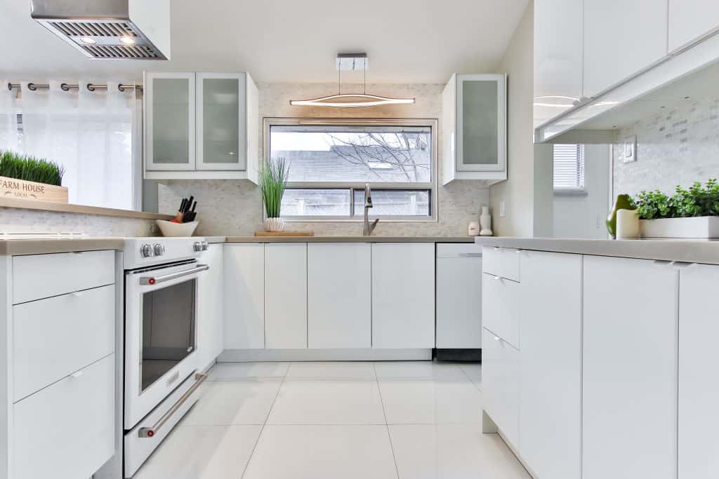
Another way to make the most of the available space in your kitchen is to choose cabinetry with minimal – or no – hardware on it. A sleeker design of cabinet creates a sense of flow throughout the room and creates a cleaner, more minimal look. This isn’t just an idea for small kitchens, however: in larger kitchens with multiple cabinets an abundance of handles and knobs can add to the visual “noise” of the space – so to keep everything looking cool, calm and stylish, skip the handles.
Bright And Early
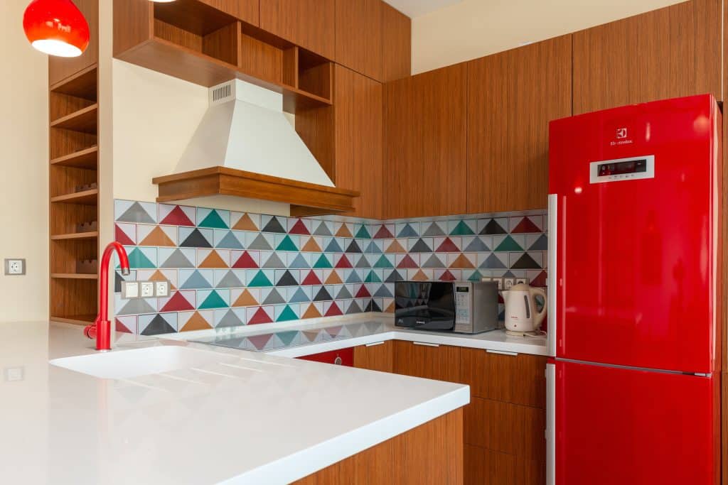
What cheerier sight to wake up to in the morning than this peppy U shape kitchen design with its fabulous tiled splash back? Contrary to the common advice that all smaller kitchens should be painted white, colour is absolutely allowed – just be sure to have a common theme running through it to avoid things looking cramped (the same goes for painting cabinet doors). Here, the central colour is a juicy shade of tomato red used on the fittings and wall, with one or two additional colours to contrast.
Multifunctional Magic
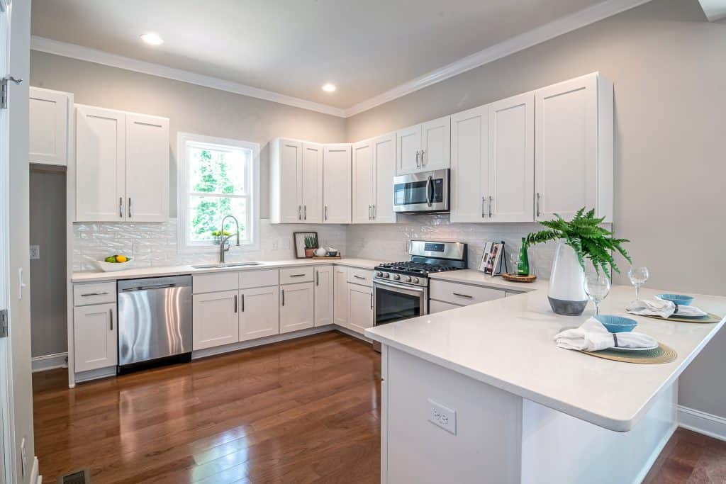
As the most often-used room, kitchens are already the stars of every home they’re in – but more recently they’ve been taking on other roles, doubling up as everything from a playroom to a home office. An out-sized breakfast bar (as seen here) is perfect for use as a small dining area, a standing workstation – or as somewhere for the kids to do their homework. The bar area can have added storage underneath – and acts as a room divider, helping to keep everything in order.
Keep It Simple
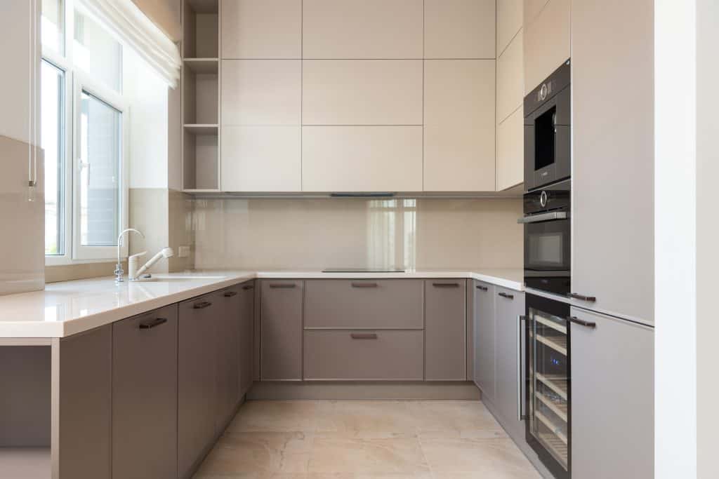
Another great example of the “less is more” look – this kitchen is all about subtlety, from two-tone dove grey and soft white colour scheme to the minimal hardware – but another way to make the most of your space in a U shape kitchen is with the appliances: as with storage, think “up” – and consider ovens and fridges that are built into the wall, rather than freestanding appliances that jut out into the available space.
Classic Cool
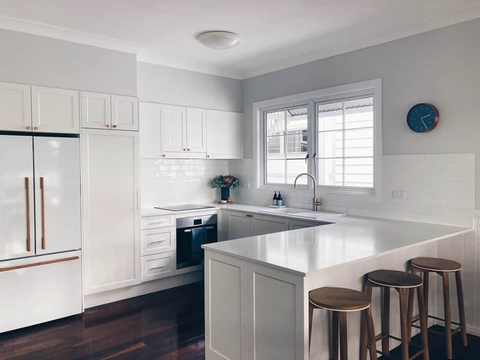
A U shape kitchen layout offers so much scope for potential in terms of style choices – but if you’re looking to make a commitment, a classic kitchen design will never steer you wrong. This all-white design with shaker style cabinetry has touches of warmth from the flooring and bar-stools, while the tonal variations in the paint used on the walls and cabinetry allows things to look spacious without appearing cold.
In The Kitchen At Parties
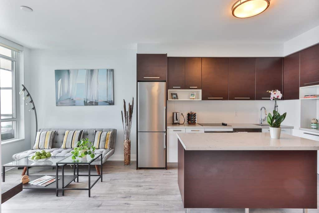
U shaped kitchens work brilliantly in open plan spaces – and this example here is no exception. The dark wood of the units contrasted with the lighter oak floors helps create a warm and welcoming space for those who love to entertain. Combining two rooms in this way adds a sense of flow and openness to the space and is ideal for guests of all stripes, whether you prefer to chat at the breakfast bar – or lounge on the sofa.
Mix And Match
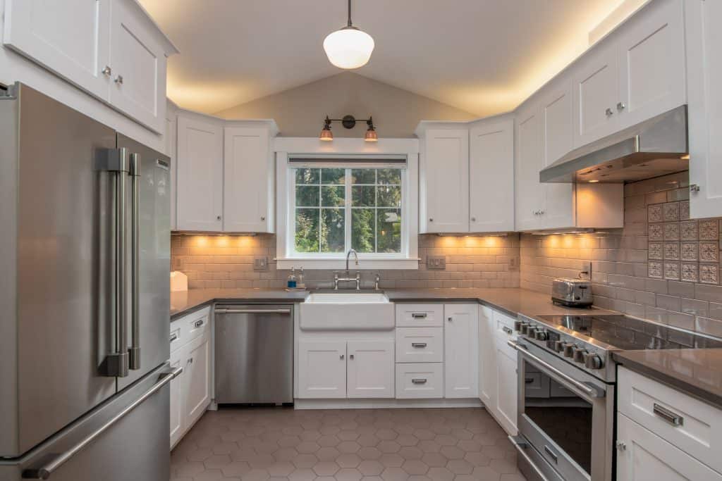
While too much detail in a smaller space can appear fussy, it can work – particularly if you have a kitchen where there is more space to play with. In this super-traditional design here, the panelled cabinetry and butler sink add a touch of rustic charm, while the subtle contrast between the subway tiling on the wall and the hexagonal honeycomb pattern on the floor are both the same shade of soft grey to keep things visually interesting without clashing.
Japanese Style
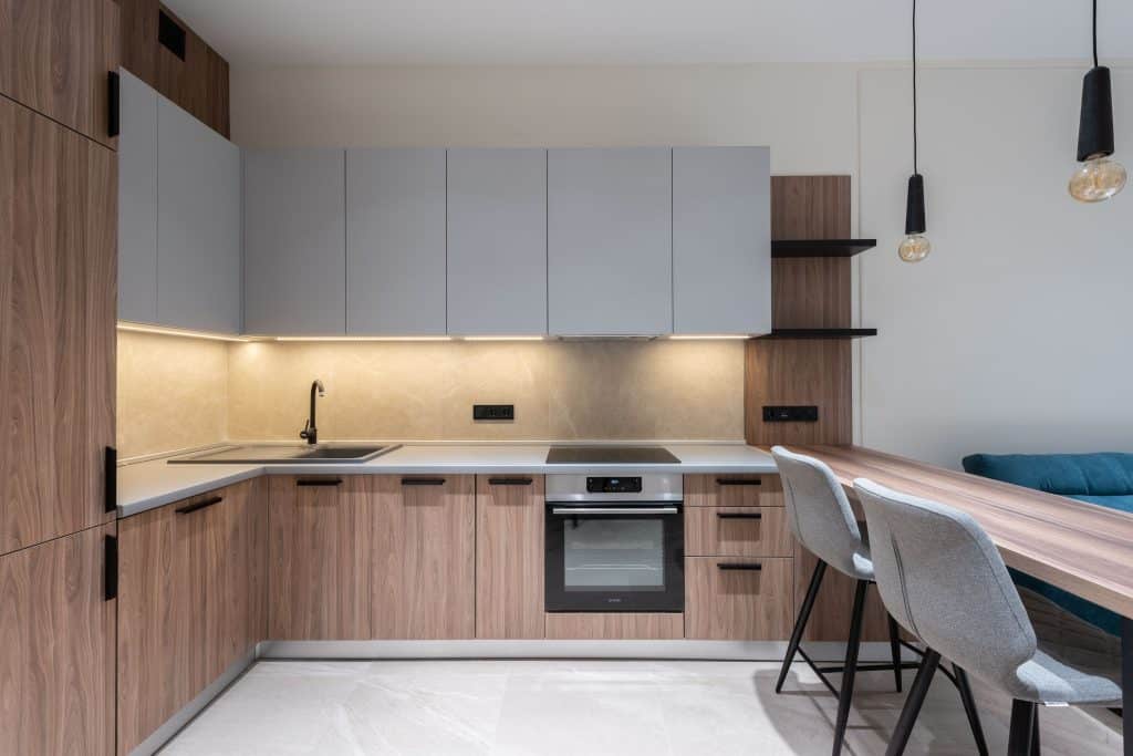
In this U-shaped space, the Japanese kitchen aesthetic comes into it’s own: subtle, monochromatic colour, wooden finishes and contrasting dark wood shelving and hardware helps create a perfectly calm space to come home to. Minimal pendant lights, as seen here over the breakfast bar are also commonly seen in Japanese style kitchens, helping to create a beautifully harmonious and simple look.
For the best in what fitted kitchens Manchester has to offer, why not plan a visit to our showroom today? We’re also available across a number of other locations including kitchens Preston, Bolton, Bury, The Fylde Coast, Blackpool, Prestwich, Ribble Valley and Blackburn and Oldham.
0 Comments